Case Study: Branding, Website and App Design

Who is MachineryMax

MachineryMax facilitates high traffic online auction marketplace offering machinery sellers and buyers a global, transparent, and easy to use system.

It is an aggregator style business model which connects machinery buyers and sellers through an online auction.

Objectives

Simplifying the UI/UX of the website and app so as to make the navigation of the website intuitive for the buyers

Services

The Challenge

The existing website had the stock layout developed by the auction software. The software had all the posts listed out in a long list irrespective of the category, deadline for the auction or the seller it was posted by.

There were no clear hierarchy rules followed or colour scheme in place. The website had a cluttered layout that was confusing for the users.

This resulted in a loss of potential sales as the users dropped off before even reaching the bidding page.

Approach

We started with streamlining the brand identity based on current trends for the targeted age groups. This included choice os colour palettes, typography, container shapes and designs.

Using this research we finalized a logo and brand pattern for MachineryMax which then became a base for the website and app design.

Brand Icon

CONCEPT BEHIND THE LOGO
A symbolic logo has been designed for Machinery Max, in order to visually express the meaning and philosophy it stands for. The triangle in a minimal format represents simple machine and upward bid. Three dots represent the people: Sellers, Buyers, and Facilitators, and the arrows indicate communication and business between these 3 parties. The angular brackets symbolize data security. An extended arm signifies a win-win situation and gives the feeling of “Maximum and
“satisfaction’. The three dots also represent the 3 important elements in Auction: Access, Trust & Value.

Brand Typo

Ravenna

A B C D E F G H I J K L M N O P Q R S T U V W X Y Z

#ff2a01
#ffb401
Optimism, Youthfulness, Positivity
Neutral 01 : #FFFFFF
#2354b8
#00b1ff
Optimism, Youthfulness, Positivity
Neutral 01 : #031C52
machinery-tape

Website Design

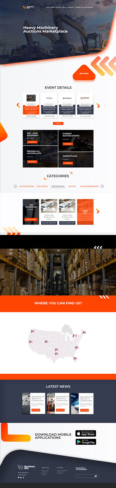
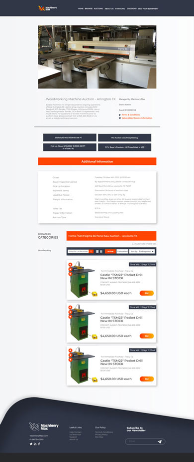
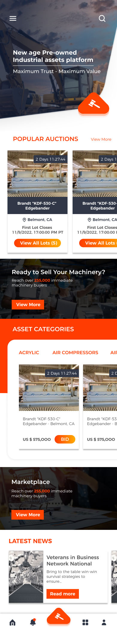
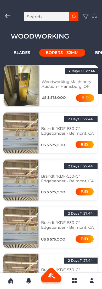
Considering the sheer number of live auctions on the website, we prioritised categorizing the auctions for simple browsing experience.

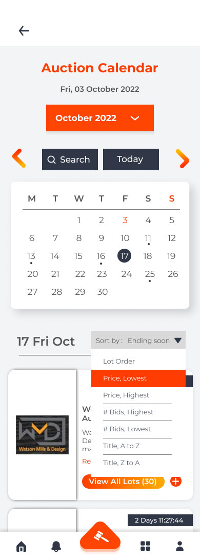
Auctions ending first also had to be prioritised to cash in on the urgency factor of an auction. These critical points for the business shape the initial layout of the website.

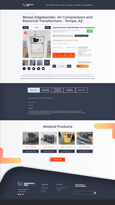
To keep the users engaged we used unconventional, modern designs for the homepage. Rest of the homepage is designed like a funnel to draw in the users further into the website leading them ultimately to the Bidding page.

App Design

App Design was a seperate challenge in itself because the users on the app are more invested in the goal of the app as they intend to keep close tabs on the happenings in the app. Due to the different nature of the users on the app, direct communication about the auctions was necessary for the app UI.

To streamline the vast number of actions that the users can take on the app, we added a hamburger menu as well as fixed navbar on the screens. This is an unconventional approach in the world of UI/UX for app but we made these bold decisions to give the end-user a delightful experience.

Validating ideas

3 Paradigms to Test

During our work improving user experience, we mapped out 3 central paradigms

Next Projects

Let's Create
Something Magical ! iOS 16.4

Scroll to Top