About Rural by Bluesalz

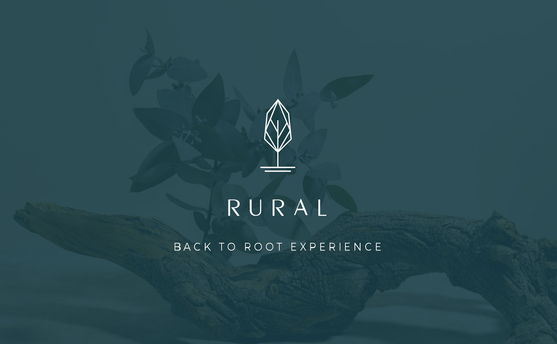
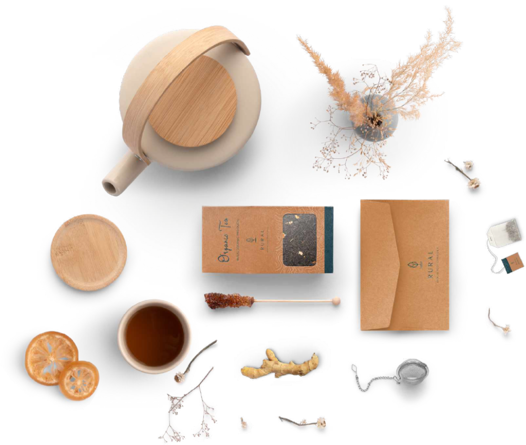
Presenting Rural, a company that offers unique rural exploration experiences. 

At Rural, they understand that one of the most fundamental yet underappreciated human needs is to feel rooted, connected to our culture and community. By providing a pure and simple way of living that’s reminiscent of the rural lifestyle, Rural helps city-dwellers to experience a lifestyle that’s completely foreign to them. 

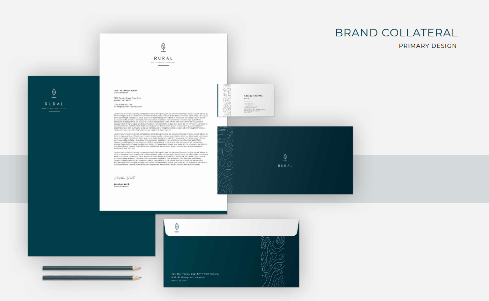
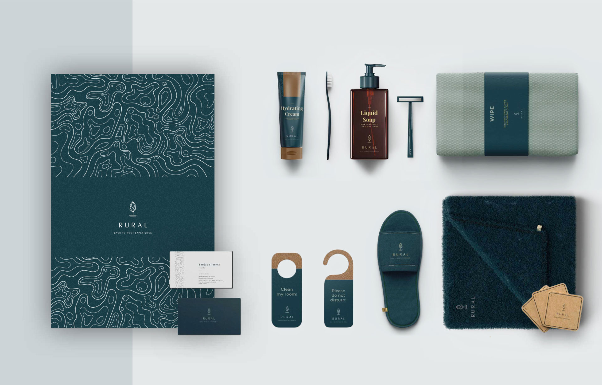
We were excited to work with Rural to revamp their branding, ensuring that their message of communal harmony and rural exploration was communicated effectively to their target audience.

Challenge

Rural faced a challenge in effectively communicating the value of their offerings to their target audience. Their existing branding did not effectively convey the message of communal harmony and pure, simple living that defines their experiences. As a result, Rural struggled to differentiate themselves in the crowd and attract a wider audience.

LOGO

LEAF + ROOTED TREE

ICON REPRESENTATION

CUSTOM DESIGNED

LOGO TYPOGRAPHY

rural-logo-w
Asset 4
rural-logo-w
Asset 4
rural-logo-w

Aesthetic

The logo design for Rural was inspired by the brand’s aesthetic. The leaf symbolizes change and the flow of energy, while the rooted trees represent the unshakable principles that define the brand. To extend the brand persona to multiple dimensions, an iconic representation was used. The logo font was custom-developed to represent both nostalgia and freshness in a single form.

Brand color

Color guide

#033F4A
#AEBDB0
#9B6B42
#FFFFFF
#000000
Primary Color
Secondary Color
Natural Color

Brand color palette represent following aesthetics:

Nostalgic
Culture
Organic
Roots
Comfort

Brand pattern

Organic texture

Brand pattern plays a vital role in brand recognition, bringing life to simple logos and helping create strong, memorable brand expressions. In some cases patterns can become even more recognizable when their is different expressions attached to a single brand. Organic texture suits perfectly to RURAL brand as their is lots of cultural diversity in all destinations.

As such, patterns connect a brand’s visual identity to its behaviors, its interactions to language, its global ideas to local actions, and its small ideas to each other. Patterns help a brand achieve responsive autonomy without losing the power of consistency.

Brands are no longer
definitive. They are
temporal. Brands are
informed by multiple
voices, and they exist in
multiple mediums and
through multiple contexts.

Calendar

Nostalgic artwork

Artwork by Indian artist and cummunity could be the face of calendar for Rural brand as it personifies brand emotions with guest.

Hotel icons

Custom designed

Artwork

Inspired illustrations

artwork-1
artwork-2
artwork-3
artwork-4

Seed bags

Nostalgic artwork

Asset 201

Organic products

All the products developed by local community for hotel guests will be branded underRural brand. It will represent signature quality and brands support towards local community

Lables will have all necessary certification tag and value chart based on product category

Asset 232

Flavours of rural

Inspired by rural India

Flavours of rural

Organic tea

Organic rea-range brand packaging. Inspired by wood.

Brand Pattern concept will follow throughout paper packaging.

Back to root experience

Device scale fit

Standard scaling

Back to root experience

Next Projects

Let's Create
Something Magical ! iOS 16.4

Scroll to Top